Exploratory Data Analysis (EDA) is a crucial step in the data analysis process that involves examining and understanding the characteristics of a dataset. It helps uncover patterns, relationships, and anomalies in the data and provides insights to guide further analysis. Data visualization is a key component of EDA that utilizes graphical representations to effectively communicate the patterns and trends present in the data. Here’s an overview of EDA and data visualization techniques:
Exploratory Data Analysis (EDA):
- Summary Statistics: Calculating descriptive statistics such as mean, median, standard deviation, and quartiles provides a summary of the dataset’s central tendency, dispersion, and shape.
- Data Distribution: Visualizing the distribution of variables through histograms, box plots, or density plots helps understand the spread, skewness, and presence of outliers in the data.
- Data Correlation: Correlation analysis, represented through correlation matrices or scatter plots, examines the relationships between variables to identify patterns and dependencies.
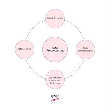
- Data Profiling: Examining the data’s structure and quality through techniques like frequency counts, cross-tabulations, or data profiling tools helps identify missing values, unique values, data types, and potential issues.
- Data Segmentation: Exploring data subsets based on different categories or dimensions can reveal variations and insights specific to each segment.
Data Visualization:
- Scatter Plots: Scatter plots display the relationship between two continuous variables, showcasing patterns, clusters, or trends.
- Line Plots: Line plots display how a variable changes over time or another continuous variable, providing insights into trends, seasonality, or cyclic patterns.
- Bar Charts and Histograms: Bar charts represent categorical variables, while histograms display the distribution of a continuous variable, enabling comparisons and identifying frequencies or proportions.
- Box Plots: Box plots summarize the distribution of a variable, including the median, quartiles, and outliers, providing a visual summary of the data’s spread and skewness.
- Heatmaps: Heatmaps use color intensity to represent the magnitude of values in a matrix, helping identify patterns, clusters, or correlations in multidimensional data.
- Geographic Visualizations: Maps and geospatial visualizations present data in a spatial context, helping understand regional variations, patterns, or relationships.
- Interactive Dashboards: Interactive dashboards allow users to explore data dynamically, filter variables, drill down into specific subsets, and visualize multiple views simultaneously.
- Treemaps and Sunbursts: These visualizations represent hierarchical or nested data structures, providing a compact view of the data’s composition and proportions.
Data visualization not only facilitates data exploration but also enhances data communication and storytelling by presenting insights in an intuitive and accessible manner. It enables stakeholders to grasp complex patterns and make data-informed decisions. Various tools and libraries, such as ggplot, matplotlib, D3.js, Tableau, and Power BI, support a wide range of data visualization techniques and can be employed based on specific requirements and preferences.